Designing a Better Checkout Experience
UI Case Study


CHALLENGE
Goals for this project is to determine if the users are able to go through the checkout process successfully and efficiently and to decrease shopping cart abandonments with certain ways of design methods.
KEY PAIN POINTS
Checkout process is too long
Information such as tax and shipping is not provided upfront
Having to create an account in order to purchase
Not having enough payment method options
Lack of hierarchy
PROJECT GOALS
Keeping the customers interested in buying while they provide their personal and payment details.
Encouraging customers to return for purchases in the future.
Simplifying the process to keep it short and concise while still providing all the possible options for delivery and payment.
Providing popular payment options available at the checkout process.
Aiming to make the checkout page more user-friendly and more secure.
User Flow and Early Phase Sketches


Execution: Design Process
During the design process, my goal was to create a familiar checkout page to the most popular websites we use today. Few of the examples that I have researched are “Glossier”, “Nike” and “Away.” I didn’t want to create a completely new experience for the users, which can feel alienated and would make the process harder.
In order to have a familiar but different design language for this design, I combined elements of the most popular websites.

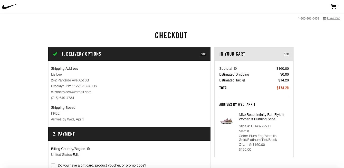
Common elements used in these website analysis: Checkout flow is 3 steps long which keeps the checkout process short and the users is not overwhelmed. Clear navigation with a seamless layout makes checkout UX a breeze.
Prototypes
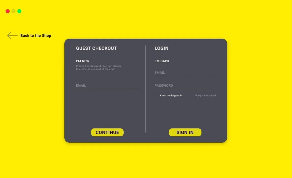
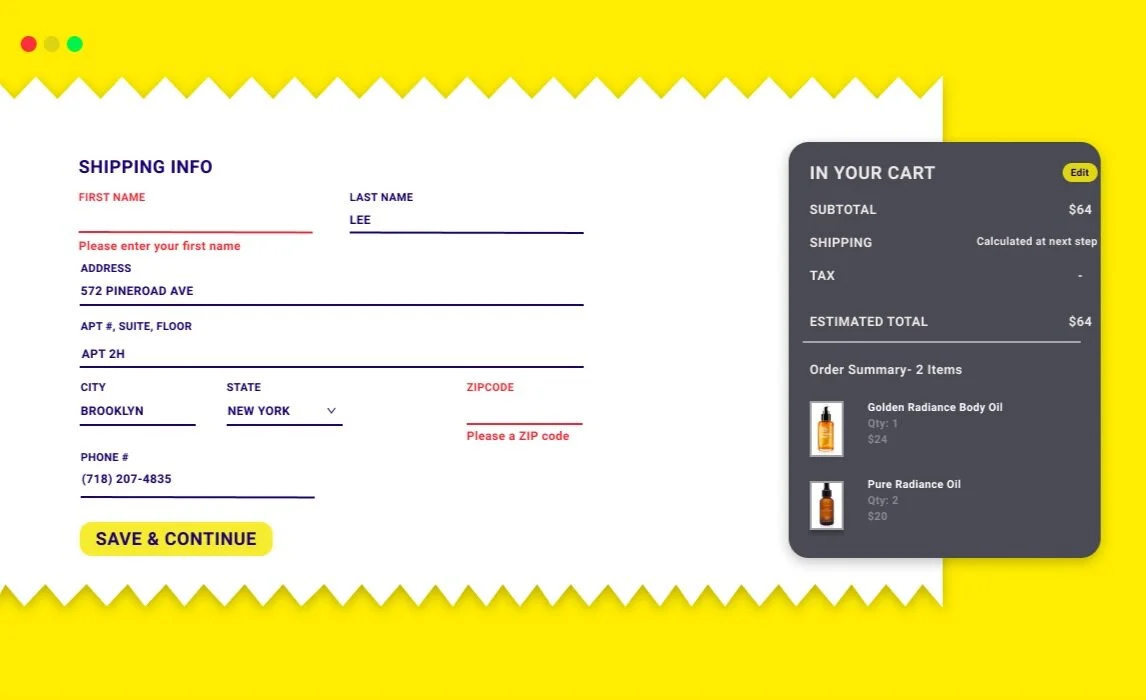
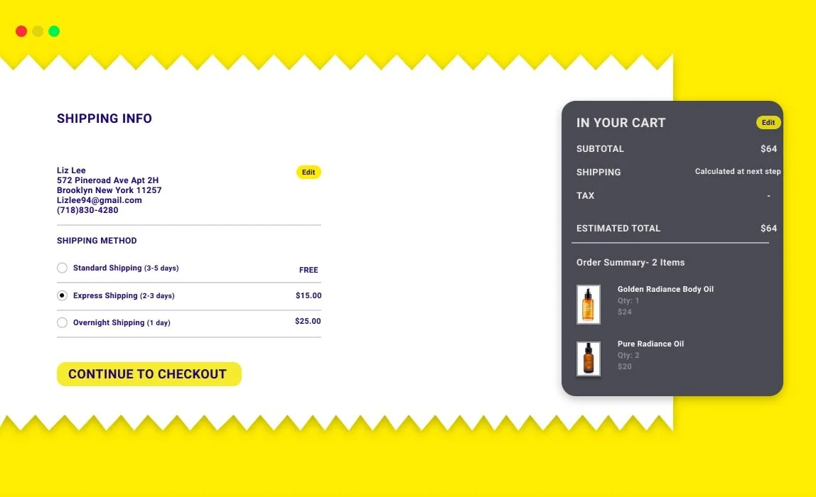
Solution for the problems
Keeping in mind that users tend to abandon long/ complicated processes, I have provided users with only the necessary information. I think it would be helpful for users to see items in their cart throughout the checkout process. To make it clear and simple for the users, every page layout is consistent. Having the left element as the fill state and the right element as the information state. Also, guest check out and sign in option creates users’ decision, whether they will want to return in the future. Sign in offers a quicker process offering users with saved information. This provides friendly-user experience and secure data for future purchases. Providing users with the most well used payment options will increase the conversion in business as well as a smoother checkout process.
Takeaways
This side project/ challenge was super motivating for me to increase my awareness for small design problems we face from day to day. After many iterations to the design, I learned that there are many ways to solve a problem. But, how we design can greatly affect the users and the business.